Preamble
These guidelines break down the elements and construction of the Suru icons and are a coming together of the legacy Suru icon guidelines and the Tango icon guidelines for FreeDesktop environment.
Composition
Suru icons are composed of simple geometric shapes. The background is usually a coloured surface with the pictogram, also composed of flat shapes, "floating" above it.

Try not to add too many small details here or use text as those will be lost when the icon is displayed at size.
The Fold Effect
In keeping with the origami motif, some Suru icons have an implied fold. In many icons this is a single horizontal or vertical line but sometimes the fold line(s) correspond or align with elements of the pictogram.
The fold is drawn simply by creating an overlay of a white or black polygon of very low opacity (usually between 1%-10%).


Grids
One of the most important aspects to designing an icon is have an overall grid system to serve as a guideline. Using a grid layout ensures consistency across all icons and will force you to reserve area for the icon background for even padding around the pictogram.

Note that the circular elements are slightly larger than rectangular elements of the grid, this overshoot is needed to compensate for the optical illusion where circular objects appear smaller than rectangular objects of the same dimensions.
Examples
Here's how the grid system works with a couple Suru icons, where you can see how each grid guides the geometry of the pictogram for each icon.


The grid is only a guideline but being conscious of it will allow you to draw exceptions.
Unit Grid
Designing with an overall pixel grid in mind is crucial to having crisp, clean icons. Since most desktop icons have dimensions that are a factor of four (16x16, 24x24, 32x32, 48x48, 256x256) using a pixel grid with lines every 4 pixels and drawing to that grid is the best practice.

Colour!
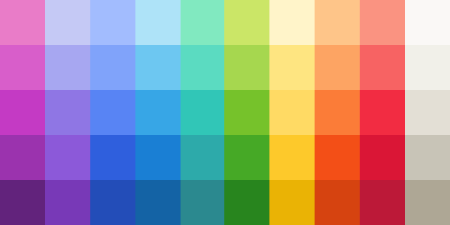
The Suru palette is full of vibrant colours! Muted tones and greys are reserved for boring system icons.
Shadows
Often a Suru icon is drawn with two distinct sets of shadows, one for the pictogram to create a drop shadow effect, and a second below the overall icon shape.
Pictogram Shadow
The drop shadow effect on the central pictogram is a combination of two shadow that are identical in shape to the pictogram:
- a shape that is
rgba(0,0,0,0.1)with vertical offset of2 pixelsand a blur of1% - a shape that is
rgba(0,0,0,0.4)with vertical offset of4 pixelsand a blur of10%
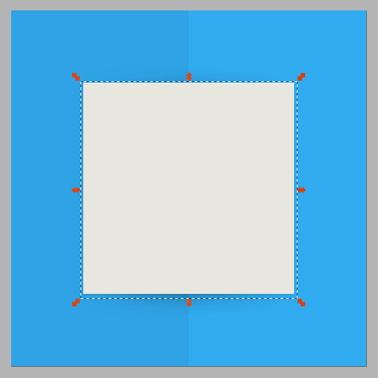
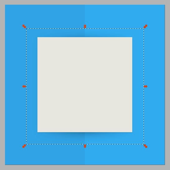
These example are presented on square backgrounds for illustrative effect.
If the fold effect is present, the second shadow is drawn using a linear gradient with three stops whose positions correspond to the location of the background fold.
Shape Shadow
The overall icon shape in Suru has a drop shadow (for contrast in addition to the outline stroke) which is composed of two shapes that are clones of the base shape:
- one that is
rgba(0,0,0,0.1)with vertical offset of2 pixelsand a blur of1% - a second that is
rgba(0,0,0,0.4)with vertical offset of4 pixelsand a blur of10%

Highlights
Pictograms have an ever-so-slight (1 pixel) white highlight along the top edge of them. To do this simple make 2 solid white copies of the main pictogram shape and move one copy 1 pixel down and "difference" the two so what's left is an "edge" that you can align to the top of the pictogram. Repeat as needed.
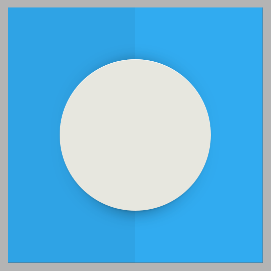
This example is presented on square backgrounds for illustrative effect.
Depending on the colour of your pictogram element, you can vary the opacity of your highlight. For instance, if it is using bright, primary colours, there isn't any need for a highlight.
Icon Sizes
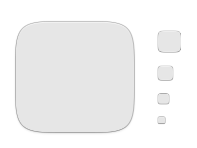
The Suru icon set provides icons at the 5 main sizes used across FreeDesktop environments (such as GNOME). 16x16, 24x24, 32x32, 48x48 and 256x256.
Design each icon for the size it's meant to be viewed at. In other words, do not design one icon and resize it to fill the remaining sizes, the best result is when each icon is drawn individually – a practice called "pixel-fitting". (I recommend reading Dustin Curtis' article, Pixel-fitting for more information).
The one exception in Suru is the 256x256 icon, since it downscales to cover the icons sizes of 64x64 and 128x128, it is drawn in a pixel-doubled fashion so details remain clear.
Outlines
All low resolution Suru icons have a thin border to improve contrast with the background they appear against as well as a slight highlight around the edge of the main icon shape just inside the border.
This border stroke size is 1px and the border overlaps the icon shape by 0.5px. The highlight is also 1px in width.


The color of the outer stroke is transparent black rgba(0,0,0,0.5) this is done to improve contrast on dark backgrounds and make the border virtually disappear.
However in icons, where the background colour is too light, a border is also added to the high-resolution icon to improve contrast and this border is 2px and sits below the overall icon shape.
